Bad Design Advice (That You Can Learn From)
Everyone has advice to give about every topic it seems, but not all advice is good advice. Today I’m sharing what I think is some seriously bad design advice, but good news - you can totally learn from it! Take this collection of bad design advice and use it to help you avoid big design mistakes. (And maybe have some giggles along the way.)
1. You can totally eyeball it!
Sure, you could take the time to measure your space to ensure the furniture you’re ordering fits in your room, but why do that when you can eyeball it? Digging out that tape measure is such a pain and finding those pesky details like height, width, depth on a listing is just plain annoying. Take your best guess and just return it if it doesn’t fit.
2. Don’t worry about budget.
Budgets are such a style killer, right? Don’t start with looking at the funds you have available for your redesign, but instead fall in love with all those expensive items that would make your design dreams come true. Honestly, if you can avoid being realistic about the cost of things in general, that’s probably the best approach. Throw caution to the (budget) wind and live your best life! Sure you’ll be in massive debt, but that gorgeous decor and fancy sofa will be enough to make you look like a success (which is all that really matters anyway) and that overpriced decorative bowl will be perfect for catching your tears when the credit card bill arrives.
3. Rug sizes really don’t matter.
Find a rug you love and order any size! It really couldn’t matter less if it looks like a tiny magic carpet floating in front of your sofa. It’s a vibe! Better yet, if you can grab a rug that sits in the center of your room so that none of your furniture touches it, that’s ideal.
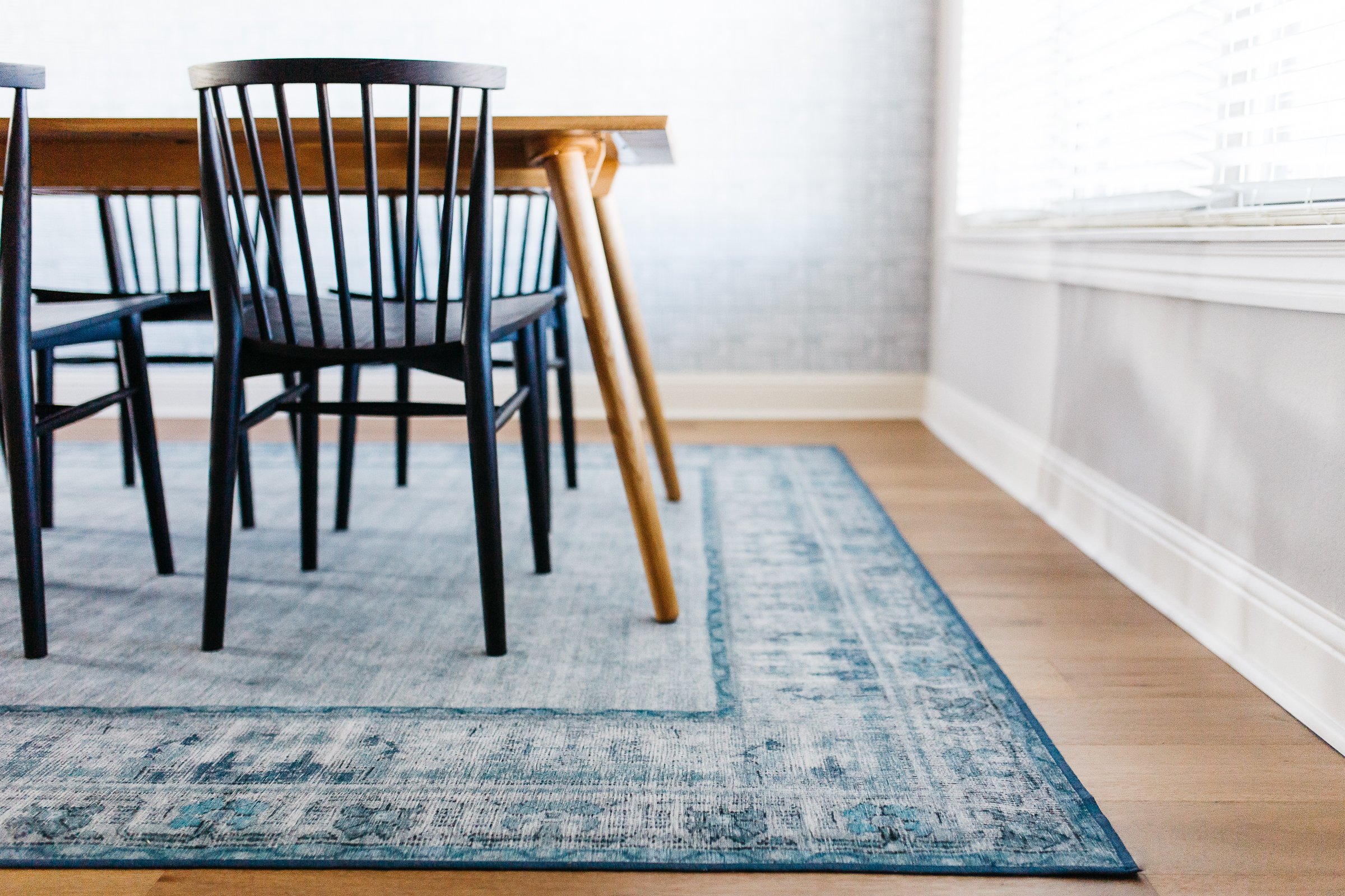
In a dining space? Let those chairs fall off the edge of the rug. Dinner parties are boring if no-one is fighting to get their chair legs positioned half on and half off the area rug. Don’t let your guests down by having an area rug that fills the space.
4. The higher you hang your art the better.
Is there a specific height you should hang your artwork? Maybe, but who cares?! Just pick a location and throw it up. Random nail in the wall leftover from a previous homeowner? Use it!
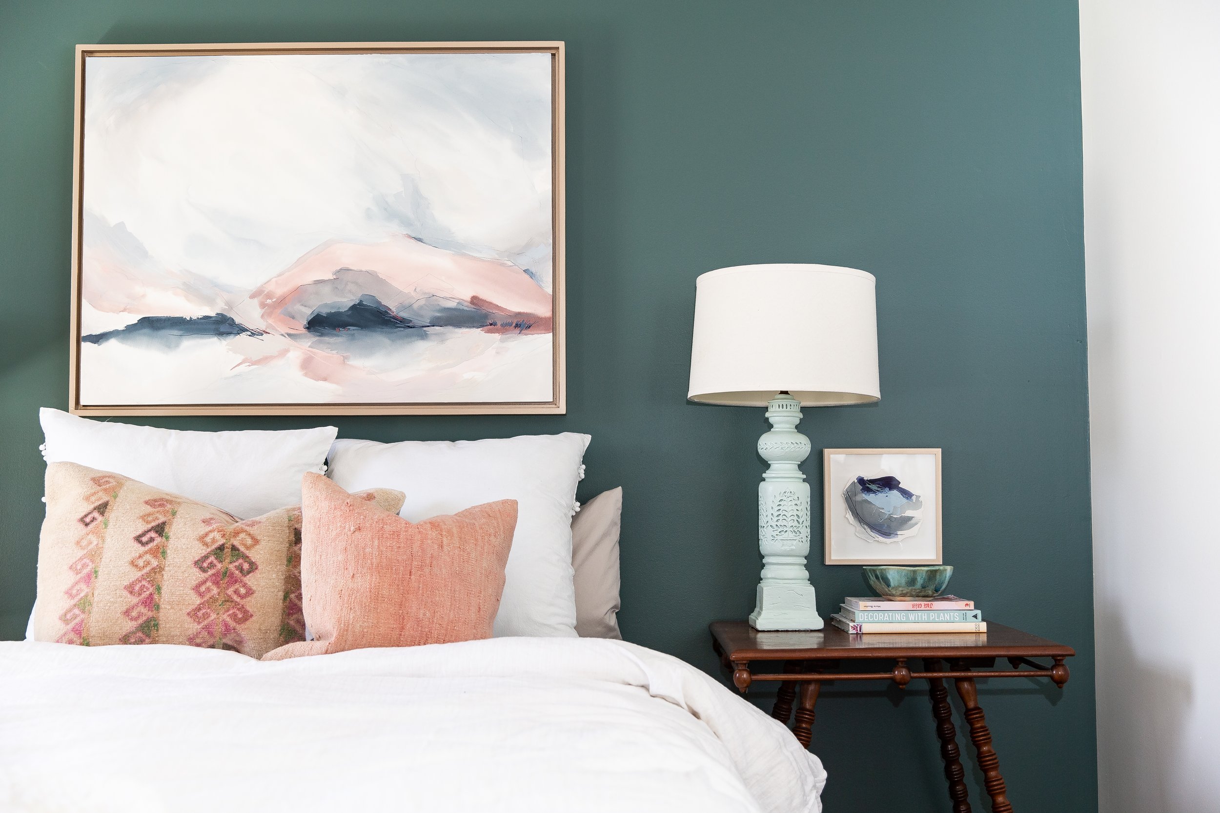
And when in doubt, hang the artwork higher. If all your guests have a crick in their neck from looking up at your wall art - boom! You’ve done it right, friend. Yes, artwork at eye-level can be convenient, but that’s not stylish or fun and you, my friend, you are stylish and fun.
5. Always use matching furniture sets.
And a forever favorite rule - always, always go for the matching furniture sets. Why shop around and create a curated, lived in, one of a kind look for your space when you can click and purchase a matching set of 5 dark furniture pieces?! I mean, come on! These furniture sets are presented in sets for a reason, right? Grab that matching sofa, loveseat, and lounge chair and live your best life!
All of this is horrendous design advice. If you take any of this seriously I cannot be held responsible. If you laughed during this blog post, you are my people. Stick around for more actually helpful blog posts or go visit these previous posts: 3 Tips for Selecting Artwork for Your Home, Thrifting + Antique Shopping: What to Grab (+ What to Skip), Three Things You Can Learn from this Bathroom Design
xo, Robin


